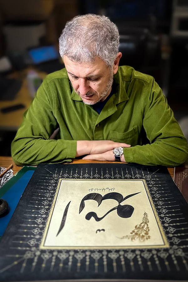
Q&A: Nihad Dukhan
Master Arabic calligrapher
By Erin Nelson
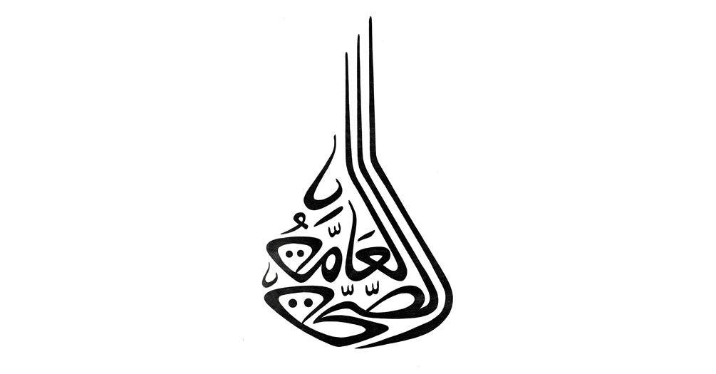
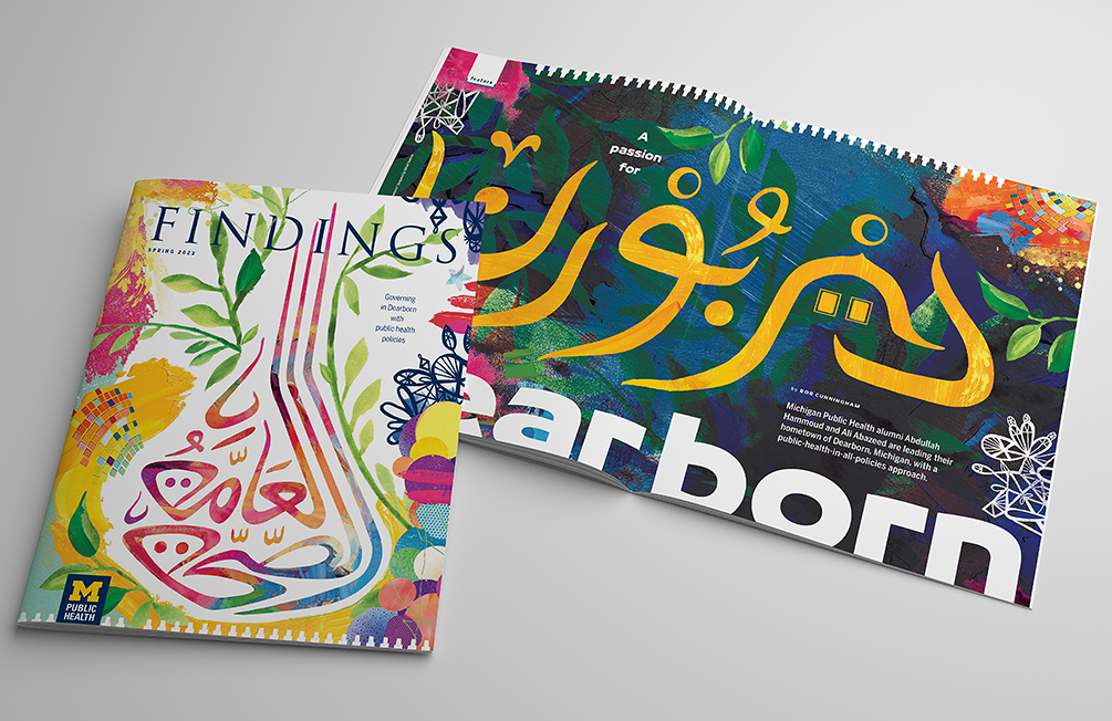
The modern Arabic calligraphy featured in this issue of Findings was designed by Nihad Dukhan (@nihad.dukhan), an Arab American master calligraphy artist and a professor of mechanical engineering at the University of Detroit Mercy. Dukhan is active in promoting Arabic/Islamic calligraphy and increasing people’s awareness of its cultural significance through exhibits, lectures and workshops. His intent is not only to attract Arabic-speaking audiences but to penetrate barriers and touch other languages and cultures.
What drew you to this artistic practice and how did your journey to becoming a master calligraphy artist begin?
I fell in love with the Arabic language when I was in the sixth grade in Gaza, Palestine. This is due to having a great teacher at the time. In addition to that, and around the same time, I started observing calligraphic designs on book covers and business signs; they looked strong, elegant and finished. Also, some of my classmates were doodling and we started competing. The calligraphy was poor but we continued the battles. We also used charcoal and wrote some of the names of famous Egyptian soccer players on external walls of some homes in our neighborhood—that was the start. I kept trying to improve my hand by continuously imitating calligraphy specimens as much as possible. This kind of practice usually does not lead to mastery, but sometimes it can lead to bad habits.
After arriving in Toledo, Ohio, to study engineering at the University of Toledo, I continued practicing. My love for the Arabic language and its literature increased and it continued to be inspiring. I still was not a master. After finishing my PhD in mechanical engineering in 1996, and working for a year, I traveled to Istanbul to meet and start studying with my teacher, grand master Hasan Çelebi (pronounced Chalabi). My journey with him took 11 years, after which I was granted the master degree in two styles: Thuluth and Naskh.
In 2006, I started training on a third style named Taliq with master calligrapher Mohamed Zakariya, who lives in Arlington, Virginia. My training with him took about seven years, and I was granted another master degree in Taliq in 2013.
This is a brief history of my journey for becoming a master of the classical styles of Arabic calligraphy. But in 1989, I had started pursuing and refining my own modern, personal style, which doesn’t abide by the strict rules of classical Arabic calligraphy. The modern look of my style was achieved through a certain artistic sensibility and a personal sense of design.
Tell us about your process and the inspiration behind the two pieces you created for Findings magazine.
The process starts with a pencil on paper and takes inspiration from the meaning or connotations of the word or text to be written. The pencil work constitutes messaging the letters and trying to combine them in an organic and consolidated form. This relies on a good knowledge of the Arabic letter shapes and how they can be stylized to serve the design.
The two pieces designed for Findings are composed in my modern, personal form. The first piece says “Public Health.” What inspired me was the fact that Public Health is an institution and should be a strong institution due to its vital importance. This idea shows up in my design in the three elongated vertical lines, which are parts of the Arabic words. These lines and their arrangement project the idea of a well-established institution, as it hints to some sort of monumental architectural element. The other idea is that by using the dots, which are parts of some Arabic letters in the two words, I could have an abstraction of two human faces representing the “public.” The two faces are not equal in size, which hints to different generations—young and old.
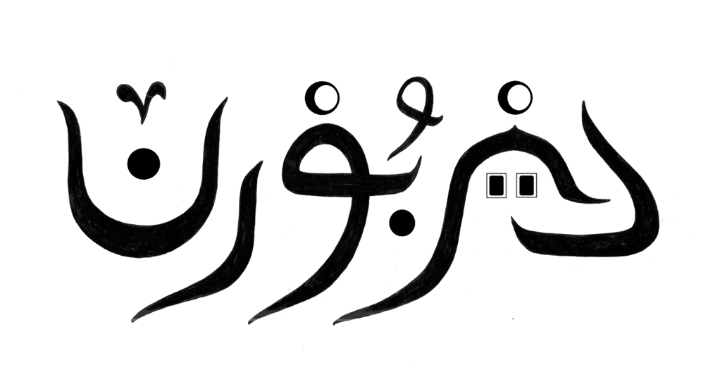
The other piece simply says “Dearborn.” As it is well known, Dearborn has a very high concentration of Arab Americans. As such, the Arab culture and Islam are visible around the city. We have grocery stores, sweets shops, bakeries, Arabic coffee stores, restaurants, mosques, the Arab American National Museum, etc. I could stylize a couple of the Arabic letters in the word Dearborn to represent two domes—one for a mosque and the other for the museum. The dome for the mosque has two square windows represented by two rectangular dots (part of an Arabic letter). I also stylized the diacritical signs used in Arabic for consonants (that are not followed by short vowels) to appear like crescent moons, which has relevance to the lunar calendar used by Muslims. The very last letter represents a small cup typically used for Arabic coffee.
Why is it important for you to share your work and promote awareness of Arabic calligraphy?
Arabic calligraphy is considered the emblem of the Arab and Muslim civilization. It is intimately connected to the Arabic language and to writing the Quran. These are fundamental parts of this civilization. In addition to this cultural and religious significance, the Arabic letters are infused with such beauty and freedom that can be leveraged to produce designs that can touch people who do not know Arabic. Sadly, I feel that Arabic calligraphy has not received the understanding, attention and support it deserves. To make things worse, sometimes this art is misrepresented. Because of all of these reasons, and because I enjoy the little fame and money I get, I try to be active in practicing and promoting this art form and increasing people’s awareness of it. In addition to working on commissions, I hold exhibits, public lectures and workshops.
- Interested in public health? Learn more here.
- Read 'Chief strategy officer has long-term vision for Dearborn' in this issue of Findings.
- Read 'A passion for Dearborn' in this issue of Findings.
- Support research and engaged learning at the School of Public Health.
Tags